Clear Design for a New Era in Banking – Bank Cler
As Digital Design Lead, I was responsible for the visual transformation of Bank Cler – from conceptualizing the new design system to the user experience of Switzerland’s first smartphone bank.
Clear Design for a New Era in Banking – Bank Cler
As Digital Design Lead, I was responsible for the visual transformation of Bank Cler – from conceptualizing the new design system to the user experience of Switzerland’s first smartphone bank.
Clear Design for a New Era in Banking – Bank Cler
As Digital Design Lead, I was responsible for the visual transformation of Bank Cler – from conceptualizing the new design system to the user experience of Switzerland’s first smartphone bank.

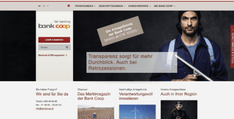
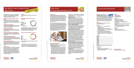
Starting Point: Bank Coop
What do you do when an established bank has to give up its name? You create something new that is even clearer. When Bank Coop needed a complete rebranding, the choice fell on “Cler” – Romansh for “clear.” What sounds simple and logical in theory required a profound transformation in practice. As a Digital Brand Designer and UX Designer at the branding agency Scholtysik & Partner, I led the seamless adaptation of this new, bold brand identity across all digital touchpoints to make it tangible for users.
Starting Point: Bank Coop
What do you do when an established bank has to give up its name? You create something new that is even clearer. When Bank Coop needed a complete rebranding, the choice fell on “Cler” – Romansh for “clear.” What sounds simple and logical in theory required a profound transformation in practice. As a Digital Brand Designer and UX Designer at the branding agency Scholtysik & Partner, I led the seamless adaptation of this new, bold brand identity across all digital touchpoints to make it tangible for users.
Starting Point: Bank Coop
What do you do when an established bank has to give up its name? You create something new that is even clearer. When Bank Coop needed a complete rebranding, the choice fell on “Cler” – Romansh for “clear.” What sounds simple and logical in theory required a profound transformation in practice. As a Digital Brand Designer and UX Designer at the branding agency Scholtysik & Partner, I led the seamless adaptation of this new, bold brand identity across all digital touchpoints to make it tangible for users.
MY ROLE: STRATEGY MEETS EXECUTION
Digital Design Lead
Responsible for the strategic and visual implementation of the rebranding across all digital channels.
User Experience Designer
Concept and development of the new digital design system and the corporate website.
UX Specialist
Strategic adaptation and optimization of the existing e-banking platform to the new brand world.
UI Designer & Brand Ambassador
Key contributor to the user interface design and brand representation for “Zak” – Switzerland’s first smartphone bank.

MY ROLE: STRATEGY MEETS EXECUTION
Digital Design Lead
Responsible for the strategic and visual implementation of the rebranding across all digital channels.
User Experience Designer
Concept and development of the new digital design system and the corporate website.
UX Specialist
Strategic adaptation and optimization of the existing e-banking platform to the new brand world.
UI Designer & Brand Ambassador
Key contributor to the user interface design and brand representation for “Zak” – Switzerland’s first smartphone bank.
MY ROLE: STRATEGY MEETS EXECUTION
Digital Design Lead
Responsible for the strategic and visual implementation of the rebranding across all digital channels.
User Experience Designer
Concept and development of the new digital design system and the corporate website.
UX Specialist
Strategic adaptation and optimization of the existing e-banking platform to the new brand world.
UI Designer & Brand Ambassador
Key contributor to the user interface design and brand representation for “Zak” – Switzerland’s first smartphone bank.
Approach
To ensure a consistent brand experience, I systematically digitized the core components of the brand. First, I defined color palettes and web typography for optimal digital readability and accessibility. Building on this, I created a comprehensive Digital Design Library as a “single source of truth.” With this foundation, I developed the new website, adapted the design for classic e-banking, and worked intensively on the concept and design of Zak, the innovative app solution from Bank Cler.
Approach
To ensure a consistent brand experience, I systematically digitized the core components of the brand. First, I defined color palettes and web typography for optimal digital readability and accessibility. Building on this, I created a comprehensive Digital Design Library as a “single source of truth.” With this foundation, I developed the new website, adapted the design for classic e-banking, and worked intensively on the concept and design of Zak, the innovative app solution from Bank Cler.
Approach
To ensure a consistent brand experience, I systematically digitized the core components of the brand. First, I defined color palettes and web typography for optimal digital readability and accessibility. Building on this, I created a comprehensive Digital Design Library as a “single source of truth.” With this foundation, I developed the new website, adapted the design for classic e-banking, and worked intensively on the concept and design of Zak, the innovative app solution from Bank Cler.
APPROACH: From Essentials to Interfaces
Strategic Digitization of Brand Identity
Definition of digital color palettes and web typography to ensure optimal readability, aesthetics, and accessibility across all digital channels.
Building the Digital Design Library
Development of a comprehensive, centralized design library as a “single source of truth” to guarantee a consistent brand experience throughout the system.
Web and E-Banking Concept
Conceptual and design implementation of the new website and seamless adaptation of the design to the bank’s classic e-banking platform.

APPROACH: From Essentials to Interfaces
Strategic Digitization of Brand Identity
Definition of digital color palettes and web typography to ensure optimal readability, aesthetics, and accessibility across all digital channels.
Building the Digital Design Library
Development of a comprehensive, centralized design library as a “single source of truth” to guarantee a consistent brand experience throughout the system.
Web and E-Banking Concept
Conceptual and design implementation of the new website and seamless adaptation of the design to the bank’s classic e-banking platform.
APPROACH: From Essentials to Interfaces
Strategic Digitization of Brand Identity
Definition of digital color palettes and web typography to ensure optimal readability, aesthetics, and accessibility across all digital channels.
Building the Digital Design Library
Development of a comprehensive, centralized design library as a “single source of truth” to guarantee a consistent brand experience throughout the system.
Web and E-Banking Concept
Conceptual and design implementation of the new website and seamless adaptation of the design to the bank’s classic e-banking platform.
Design: The New, Friendly Bank
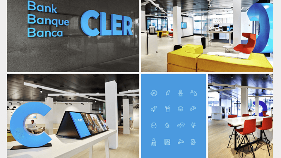
The result is a fundamentally new, fresh, and unconventional design for a friendly bank. Bright colors, highly legible fonts, and memorable logos deliberately break with traditional banking clichés. This visual boldness hit the mark: digital transformation demands financial solutions that are simpler, cheaper, and more transparent. The most important and successfully met design requirement was a radically clear user experience across all touchpoints – from the first website visit to daily financial management in the app.
Design: The New, Friendly Bank
The result is a fundamentally new, fresh, and unconventional design for a friendly bank. Bright colors, highly legible fonts, and memorable logos deliberately break with traditional banking clichés. This visual boldness hit the mark: digital transformation demands financial solutions that are simpler, cheaper, and more transparent. The most important and successfully met design requirement was a radically clear user experience across all touchpoints – from the first website visit to daily financial management in the app.
Design: The New, Friendly Bank
The result is a fundamentally new, fresh, and unconventional design for a friendly bank. Bright colors, highly legible fonts, and memorable logos deliberately break with traditional banking clichés. This visual boldness hit the mark: digital transformation demands financial solutions that are simpler, cheaper, and more transparent. The most important and successfully met design requirement was a radically clear user experience across all touchpoints – from the first website visit to daily financial management in the app.
Achievements & Impact
Achievements & Impact
Achievements & Impact
High acceptance & growth: The unconventional design and intuitive, radically simplified UX struck a chord with the young target group, leading to rapid user growth.
Award-winning branding: The bold and holistic brand work by Scholtysik & Partner received numerous international awards, including the REBRAND 100 Global Award and the German Brand Award.
Successful transformation: The seamless and scalable transfer of brand values into a modular digital design system proved that complex banking can be simple and accessible through excellent UX/UI design.

© 2026 Thomas Wild - Made with Stitch AI, Figma & Framer
© 2026 Thomas Wild - Made with Stitch AI, Figma & Framer
© 2026 Thomas Wild - Made with Stitch AI, Figma & Framer